
Tapti
A creator first social media management platform, researched, rebranded and designed end to end, from the first user interview to a launch ready product.
Tapti is a desktop first social media management workspace for agencies and creators. It brings publishing, collaboration, approvals and analytics together in one calm, connected system.
A rebrand that gave the product a direction to sail in.
The name comes from the Tapti River, so the mark became a minimalist sailboat. A boat navigates shifting currents with direction and control, exactly what Tapti gives a creator moving through the chaos of content, engagement and analytics. Clean, geometric and instantly recognisable, it tied the brand back to its roots while reading as a modern, tech forward product.
 tapti.ai / workspace
Six months, four phases, one clear arc.
The job was scattered across a dozen tools.
Agencies run every creator through a patchwork of apps. Content misaligns, versions get lost, and reporting is stitched together by hand.
Tapti brings publishing, planning, approvals and analytics into one connected workspace.
One workspace, organised around four jobs.
Seven decisions that made it feel like one product.
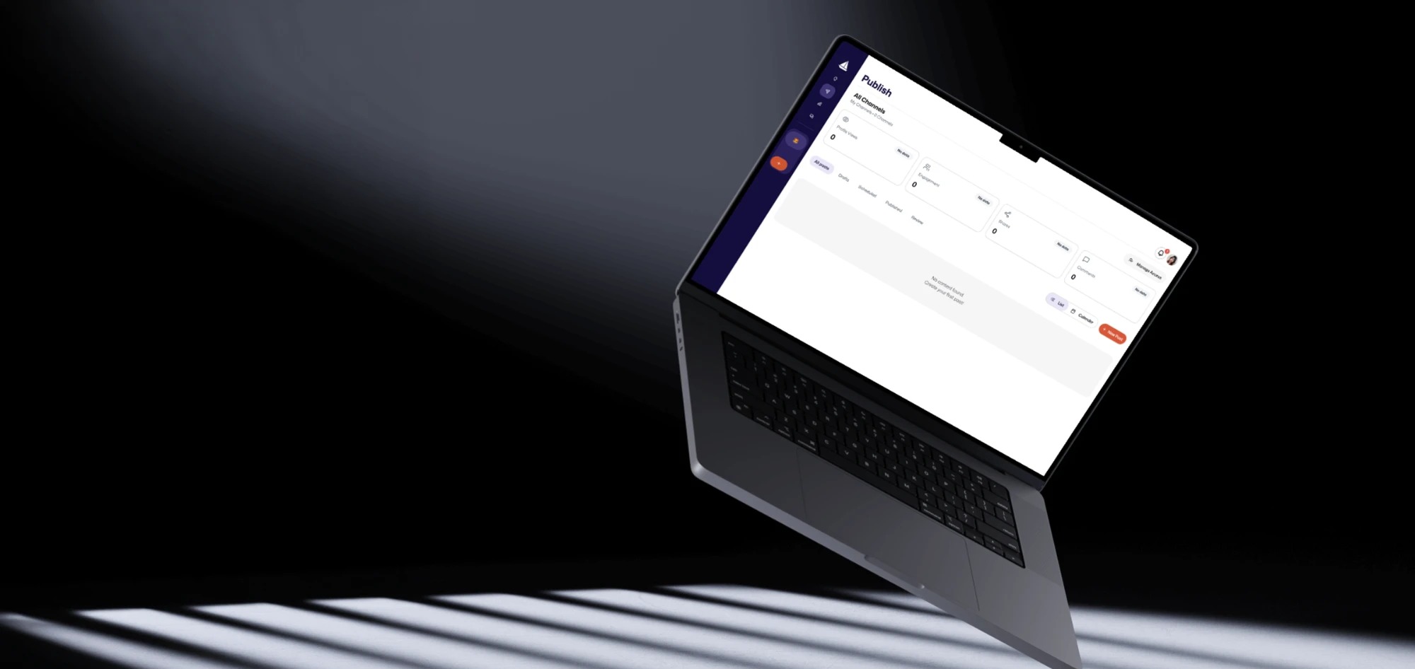
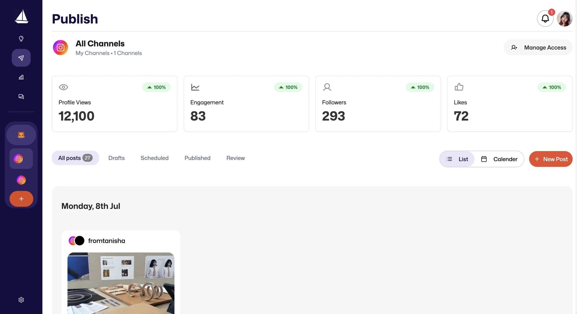
Every channel, state and headline number lives on one Publish screen. Drafts, scheduled and published flow without ever leaving the view.
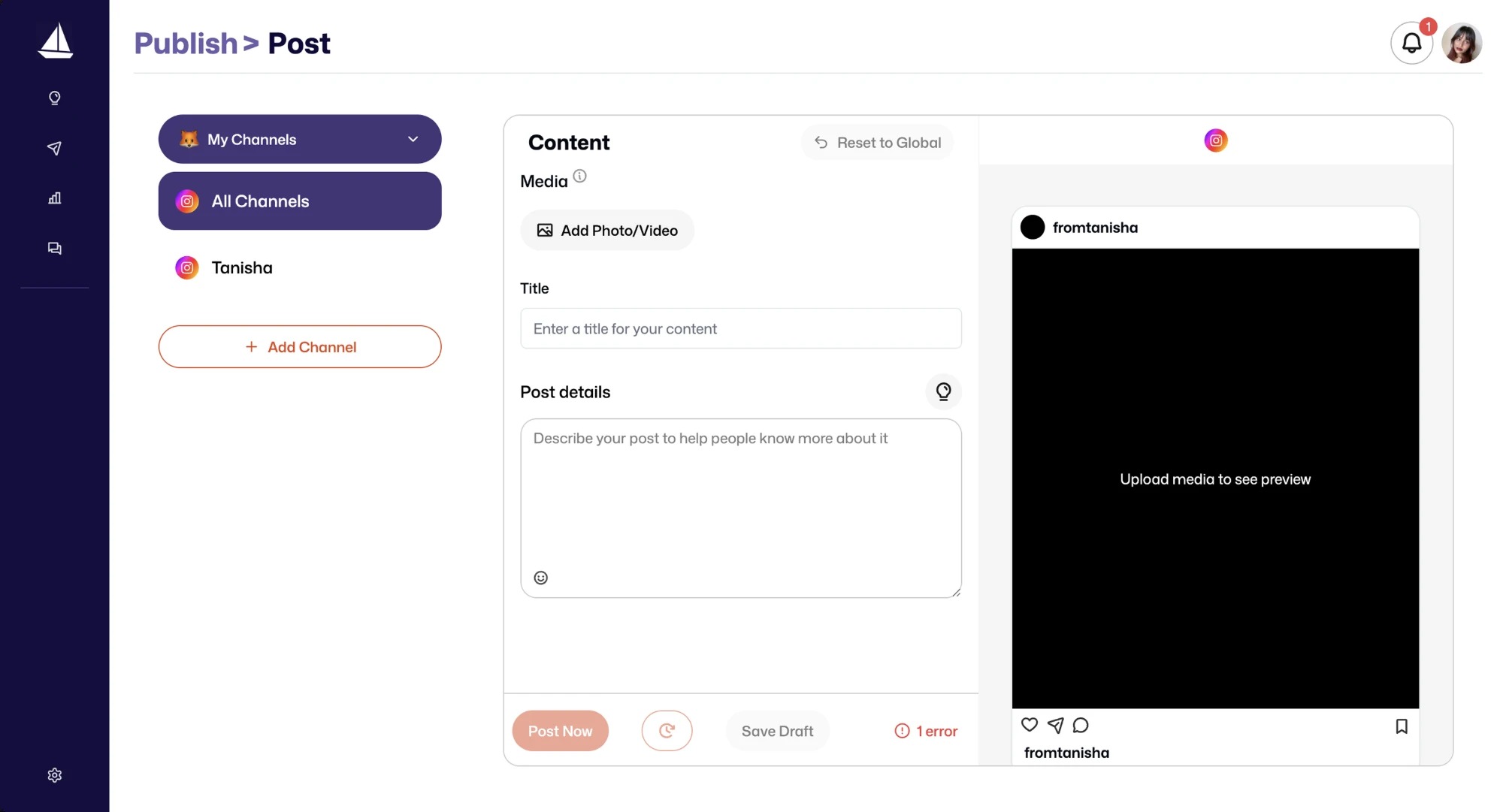
The post is written on the left while the real platform preview updates on the right. Nothing is ever published blind.
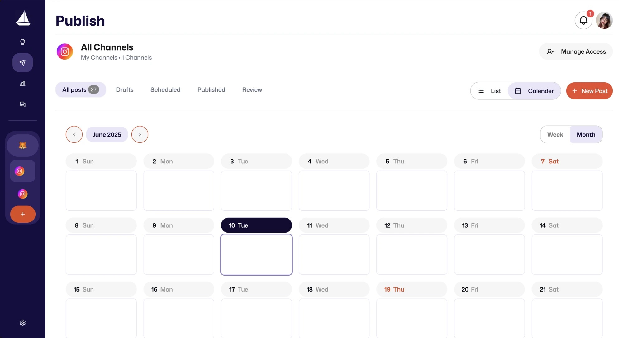
One switch turns the list into a full month view. A whole content plan becomes visible at a glance.
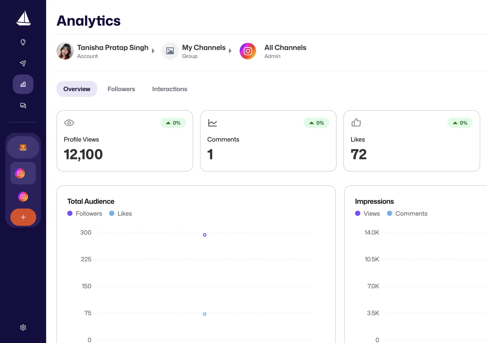
Analytics leads with the headline numbers before any chart. The hard part of a social tool is making data feel calm.
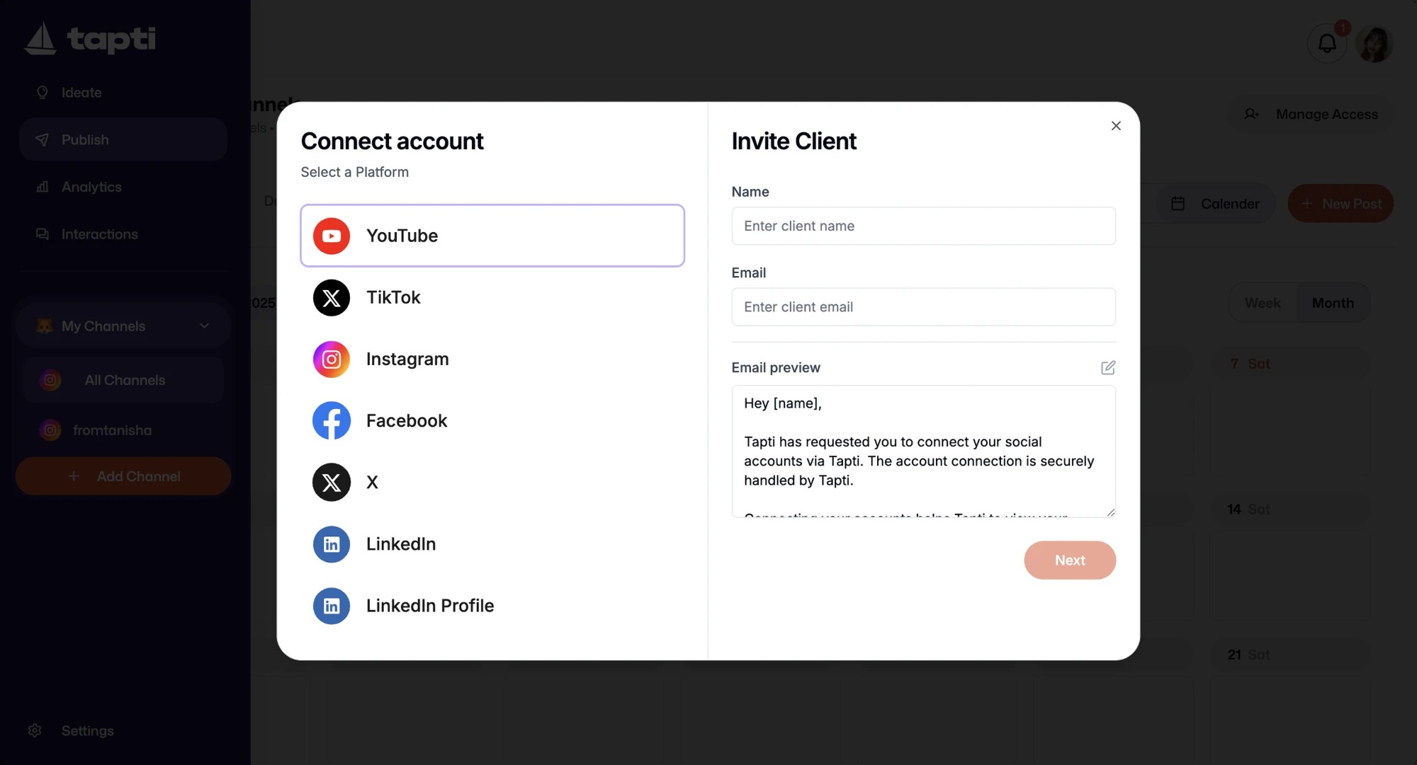
Add an account in a step, or invite a client to connect their own. Unlimited channels was the promise, so it had to be effortless.
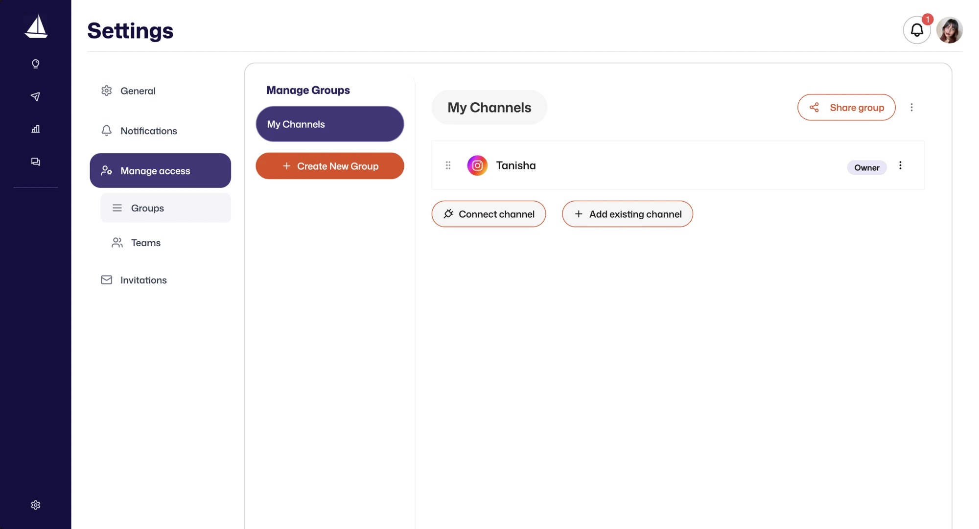
Channels roll up into groups, people into teams, access granted with intent. Multi creator work was the gap competitors left open.
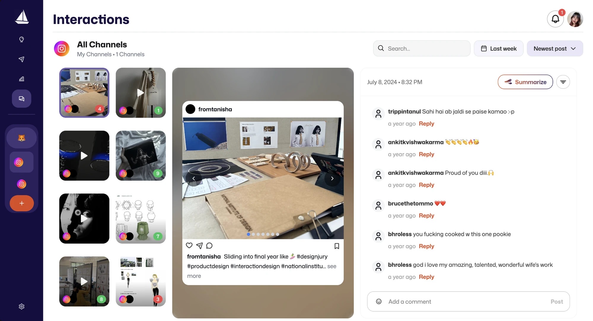
Comments from every channel land in one place, with an AI summary and a sentiment read on each post. The noisiest part of social, made calm.
Creating and scheduling a post.
One primary colour, held across every theme.
The goal was never just utility. It was a tool that feels good to use.
What the design changed.
Value delivered
The rebrand brought cohesion and warmth, the UI redesign added consistency and removed the friction found in testing, and features like AI sentiment analysis and readable analytics set Tapti apart from the tools it was measured against.
Honest framing
This was a graduation project on a live product still in its MVP phase. The outcomes describe the design work and the direction it set for Tapti, not audited launch metrics.